Immrs
In today’s fast paced culture it’s easy to miss major news events as they unfold. Sometimes even after a few days already, it’s hard to trace back to where it all started. Immrs brings you up to date in under fifteen minutes by curating the best articles for each event.
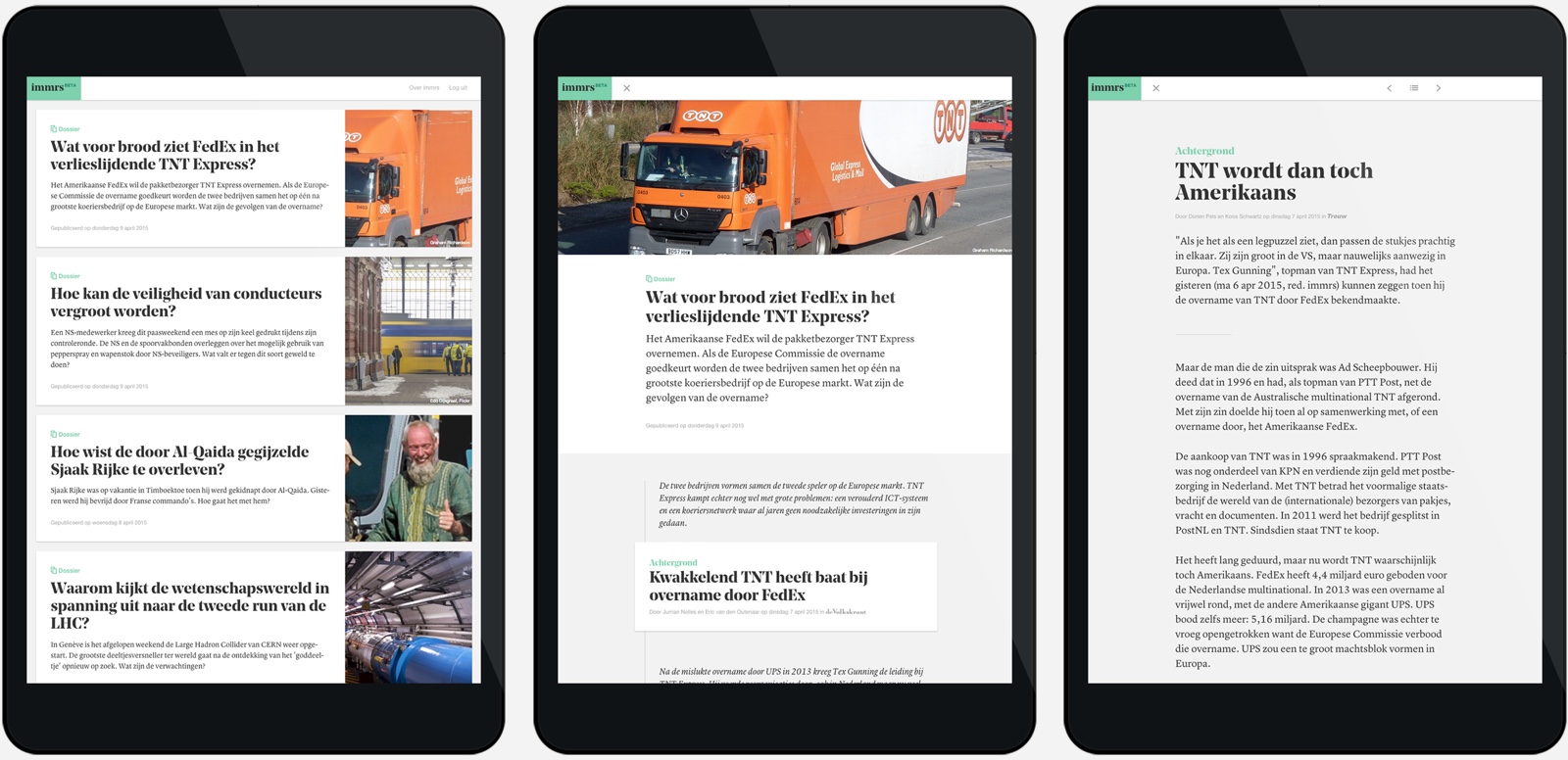
A collection of articles is dubbed a bundle, and the concept of creating one is pretty straightforward. Each day the Immrs editorial team picks out two topics—such as ISIS or the US elections—and they research which articles give you the best overview of that those topics. Articles are sourced from a database which contains the majority of local and national newspapers. The best ones are then bundled in an order that makes sense for the reader.
An interface without distractions
An important goal was to bring the user a reading experience without distractions. This is visible in a broad sense by having an interface that doesn’t get in your way. But you can also find it in the little details, like the absence of links inside articles.
Designing and building the UI was done in itterations, and it definitely didn’t end up where it started. Early sketches where rough—as I feel they should be—and focussed mostly on what should be communicated to the user at what point. How much information do you need before you click on an article? Is the date important? Does the source of an article play a big role, or do you trust our curation? The Immrs team did constant user testing, which provided us with valuable insights as to what was important.
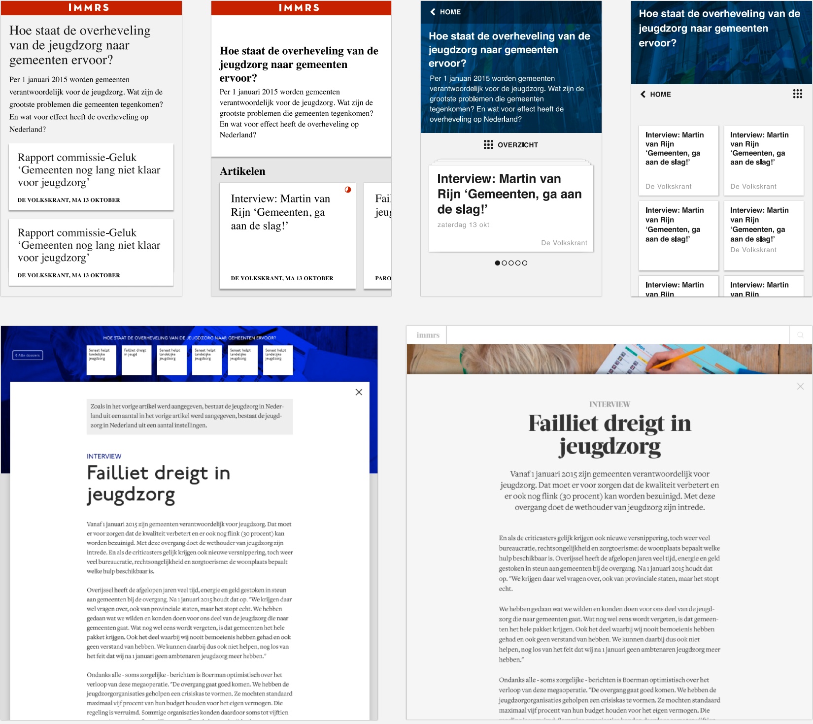
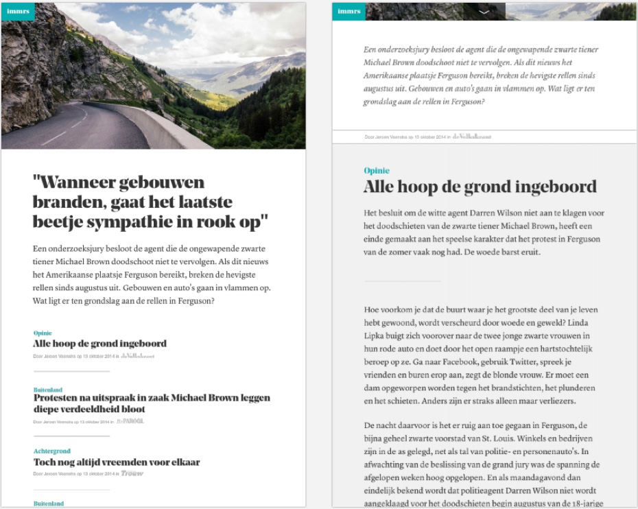
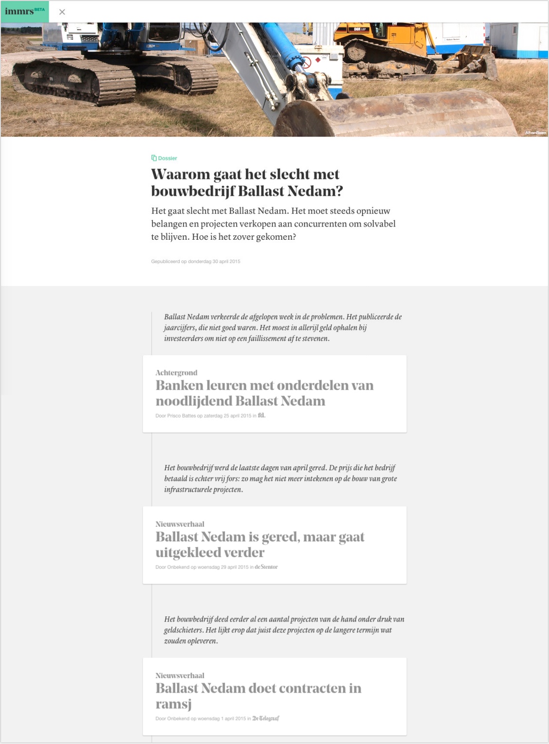
Each article is accompanied by a paragraph of text written by the editorial team, where they explain why this article is of importance. One of the hardest parts of the interface design was how to put this information in the right context. We decided to create a small storyline in each bundle. When reading the overview, it reads like a factual Reuters release. But you can dive into the articles at any time to get more background info.
Typography
Oliver Reichenstein once wrote that ‘web design is 95% typography’. For Immrs it’s probably closer to 98%, because of the simple interface and lack of visuals. So Bas Jacobs, typographer and co-founder of the Underware type foundry, joined the project to help out. We wanted to pair bold, expressive headings with highly legible body text. In total we researched 89 fonts, a selection of which was tested across various browsers and operating systems. In the end we settled on Noe Display by Schick Toikka, and Lyon Text by Carvalho Bernau. The Noe especially gives Immrs most of its character, and makes it recognizable as a brand.

Micro-typography
For optimal legibility, setting the type correctly is at least as important as choosing the right typeface. I think the general feeling amongst web designers nowadays, is that typography on the web is pretty advanced. But if you take a look at the tools available to print designers, that’s not true at all. To quote Bas Jacobs: ‘Micro-typography on the web today is worse than in the Gutenberg Bible of 1450’. Support for features like stylistic alternates, fractions, and oldstyle numerals are only now beginning to appear in browsers.
One of the biggest shortcomings in my opinion though, is the lack of hyphenation. This is even more true for smaller screens, where you’re inevitably dealing with shorter lines. Hyphenation algorithms used by software like InDesign are almost all based on TeX, a typesetting system designed by Donald Knuth in 1978. That’s right, almost 40 years ago. Unfortunately, up to this point TeX has failed to find its way into any browsers [1]. We implemented Bram Stein’s Hypher, a JS based hyphenation engine, instead. This does lead to a performance penalty: loading the library and local language pattern is not free, on top of which comes JavaScript having to parse the whole article. The trade-off was worth it here though, giving the amount of time our users where spending on Immrs.
User feedback
The overall response was very positive. People liked that we stayed out of their way when reading. Because only two bundles a day were published they never felt overwhelmed, even if they were just browsing through Immrs once a week. The thing they missed most was having bundles and articles recommended to them, since everybody got the same content in chronological order. This is definitely an area I would’ve liked to explore further.
The Immrs Beta test ran for 5 months in 2015, during which we refined and improved the platform. Talking to users and seeing how they used the platform laid a solid foundation for Immrs. They’re currently working on possible business models, and gauging interest from various target groups.